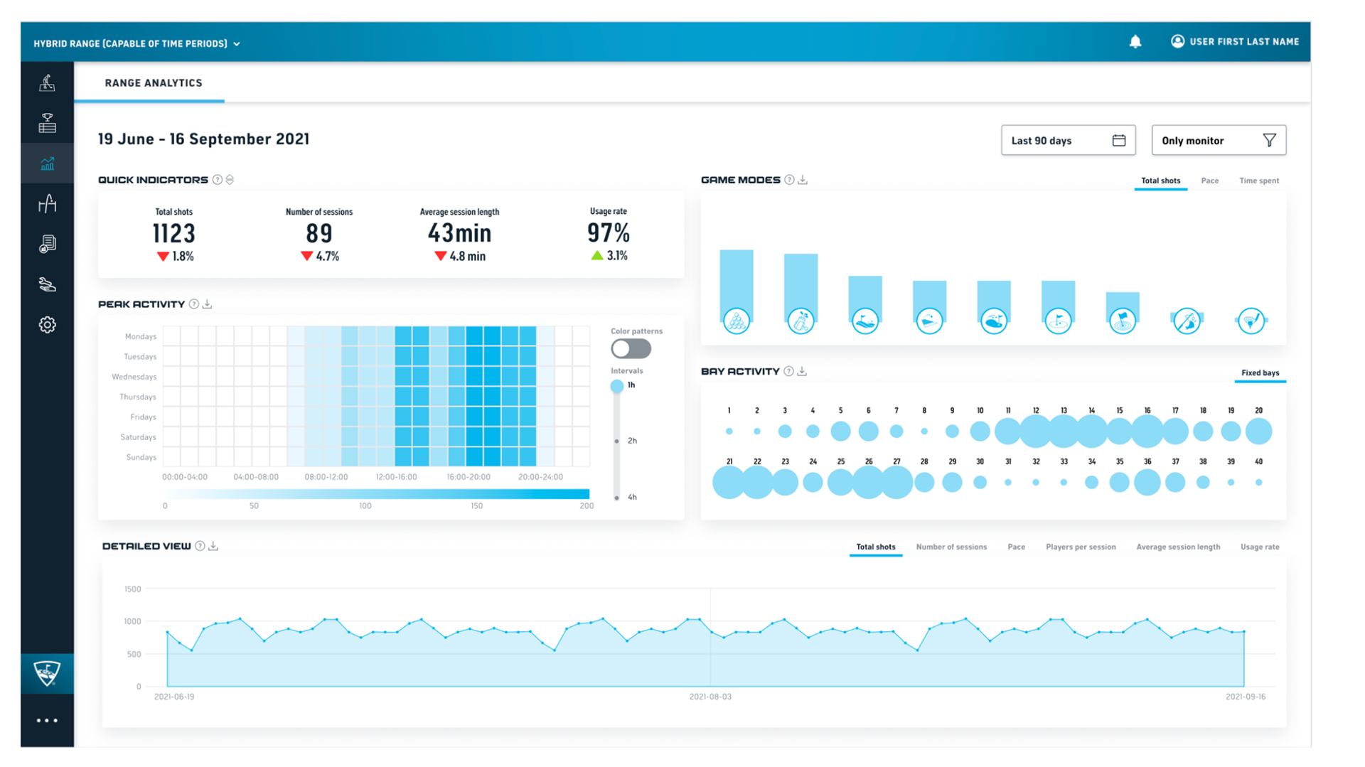
The Challenge and Context
Our challenge was simplifying complex business data, especially for users less familiar with interpreting data visuals. We aimed to eliminate manual calculations for users, providing readily processed data for informed decision-making. Our overarching objective was to assist users in attracting more customers and comprehending the impact of certain events on their business.
Solution Strategy
To address this challenge, I followed a systematic approach. I conducted a survey to gather user insights on necessary information. User interviews helped me gain deeper understanding of their needs. Drawing from industry best practices and previous research, I selected suitable data visualization models. User testing confirmed the users' understanding of the chosen visuals, and I improved clarity by adding tooltips to define metrics.
Outcomes and Impact
The dashboard became a widely embraced feature, with users globally benefiting from clearer insights into their businesses. Success stories emerged, highlighting the dashboard's role in showcasing the effects of business decisions on revenue. We deliberately kept the dashboard clean, reserving detailed usage instructions for a future update. Reflecting on the project, we realized the importance of early internal discussions on data provision and the involvement of diverse stakeholders.
Key Takeaways
- Successfully developed a user-centric analytics dashboard for actionable insights
- Tangible evidence of user-derived value and revenue comprehension
- Strategic alignment for future enhancements, including detailed usage guidance
- Valuable lessons on early stakeholder engagement for smoother execution